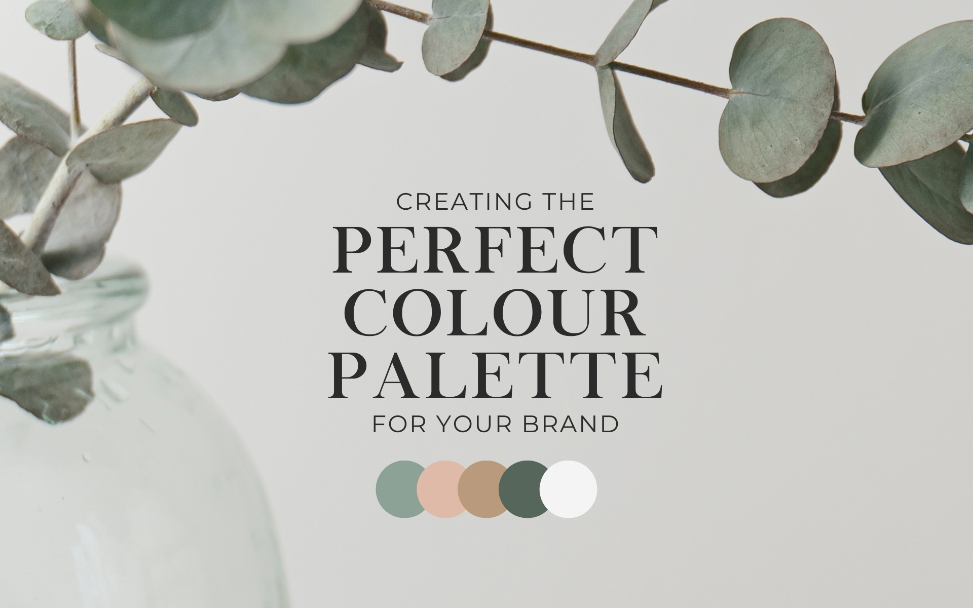
Creating the perfect colour palette for your brand
When it comes to picking colours for your colour scheme, you’ve got to think about a few things that really matter – your brand identity, who you’re talking to, and the message you want to send out. Here are some tips to help you choose the right colours 🎨
1. Primary Colour
Choose a dominant colour that represents your brand’s personality and values. This colour will be the primary identifier of your brand.
2. Secondary Colour
Select a secondary colour that complements the primary colour. This colour can be used to add variety and visual interest in your design. It often plays a supporting role.
3. Accent Colour
An accent colour is a vibrant or contrasting colour used sparingly to draw attention to specific elements, such as call-to-action buttons or important information.
4. Neutral Colours
Include neutral colours like white, black, or gray to balance the palette and provide a clean background. Neutral colours are versatile and help prevent visual overload.
5. Extra Colours (Optional)
Add depth with colours made by combining primary and secondary colours.
6. Consider Cultures
Be mindful of cultural associations attached to colours. For example, red may symbolize luck in some cultures but signify danger in others. Research the cultural meanings of colours, especially if your brand has a global audience.
7. Accessibility
Ensure your colour choices meet accessibility standards, especially if your design will be viewed on digital platforms. Colours should have sufficient contrast for readability and inclusivity.
8. Versatility Across Platforms
Consider how your colours will appear across various platforms, including print and digital media. Some colours may look different in different mediums, so test and adapt your colour scheme accordingly.
9. Inspiration
Seek inspiration from your industry, nature, art, or design trends. Analyze colour palettes that resonate with your brand’s essence and adapt them to suit your unique identity.
10. Consistency
Maintain consistency across your branding materials by using the same colour scheme. This consistency reinforces brand recognition and helps build a strong visual identity.
Make sure to keep it simple, consider your audience, and stay consistent for a strong and recognizable brand.